A Trader’s Guide to Line, Bar, and Candlestick Charts
A technical breakdown of the three essential chart types used by traders—line, bar, and candlestick—and how each reveals different layers of market structure, momentum, and trend behavior.
 Lucas Grant
Every technical analyst starts with the same foundation: understanding how price is displayed. The chart type you choose determines how much market structure you actually see — trend, volatility, momentum, liquidity grabs. Strip the noise or expose it. Your choice.
The three primary formats are line, bar, and candlestick. Same market, same data — very different read. Here’s how each one works and what kind of information it unlocks.
1. Line Charts
Line charts are the cleanest representation of trend. One line. One datapoint: the close.
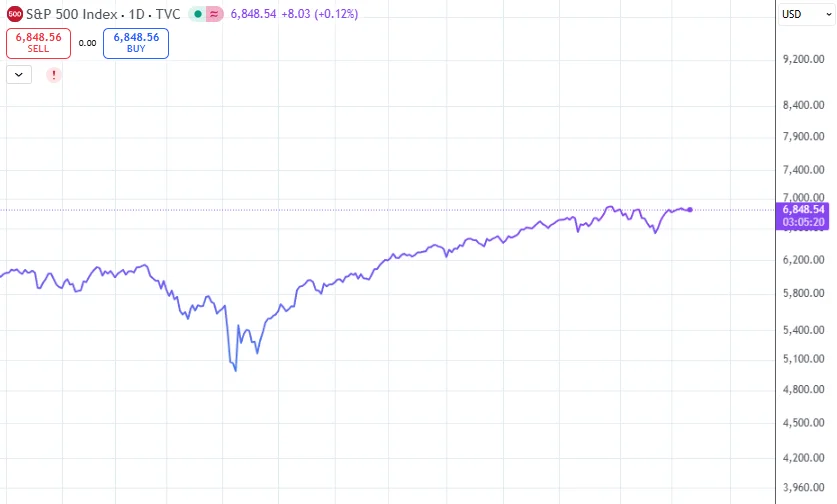
No intraday wicks, no open, no high/low range. Just the final print of each period connected across time. This filters out noise and exposes the directional bias of the market.
What Line Charts Reveal
- Macro trend structure — the “HTF bias”
- Momentum shifts when the slope changes
- Key turning points without intraperiod volatility
They are perfect when you want pure direction, nothing else. On the HTF, a line chart often tells the story more cleanly than anything else.
2. Bar Charts
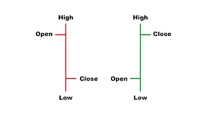
Bar charts introduce structure: open, high, low, close — OHLC. Now you’re seeing the internal battle inside each candle.
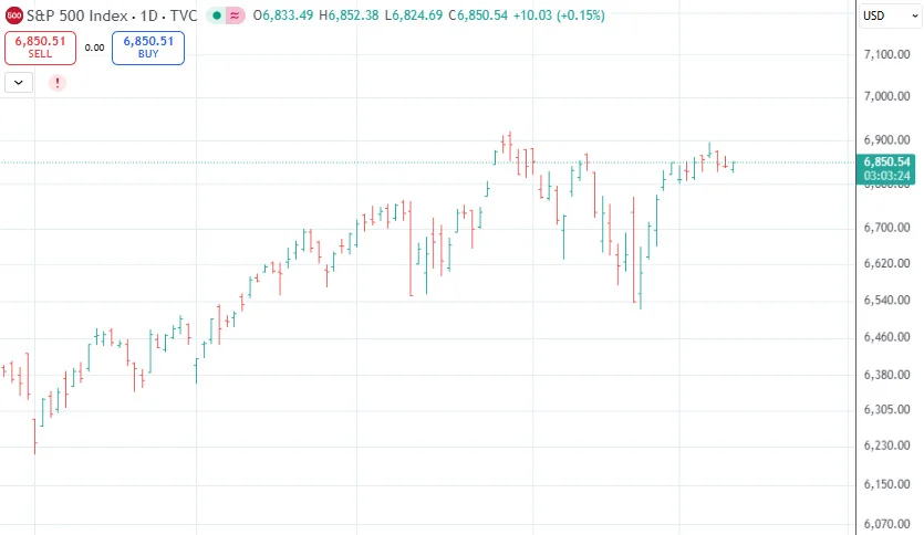
A single bar shows:
| Component | Meaning |
|---|---|
| Top of bar | Highest price — upside extension |
| Bottom of bar | Lowest price — downside sweep |
| Left tick | Open — starting point |
| Right tick | Close — who controlled the period |
What Bar Charts Reveal
- Volatility (high–low range)
- Buyer vs. seller control (open-close relationship)
- Rejection points — the exact levels where price was denied
Switching from line to bars exposes the “pulse” of the market. You start seeing how aggressive each side was and where momentum stalled.
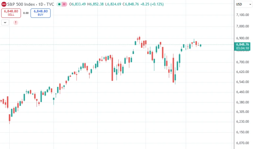
3. Candlestick Charts
Candlesticks are the industry standard. They show the same OHLC data as bars, but the structure is more intuitive: body, wicks, color. Market psychology becomes visible — instantly.
Candlestick Components
- Body — distance between open and close; the “real move”
- Upper wick — where buyers were rejected
- Lower wick — where sellers were absorbed
Why Traders Prefer Candlesticks
- Immediate read on who controlled the period
- Trend continuation and exhaustion are obvious
- Patterns signal reversals and liquidity events
- Momentum is visually clearer than in bar charts
Hammers, doji, engulfing, inside bars — all of them map directly to shifts in control, liquidity hunts, and trend rotations. On any timeframe.
Line vs. Bar vs. Candlestick
Each chart type reveals a different layer of market structure:
| Chart Type | Strength | Best Use |
|---|---|---|
| Line | Clear HTF trend | Momentum bias, trend mapping |
| Bar | Volatility + control | Identifying rejection and compression |
| Candlestick | Psychology + patterns | Active trading, reversals, breakout validation |
Most traders switch between them. Line for clean bias, bars for internal structure, candles for execution. When used together, they offer a full read of trend, velocity, and risk.
Mastering line, bar, and candlestick charts is the starting point for any serious technical analyst. They are the lens through which market structure becomes visible. Choose the right one for the job — HTF trend, intraday volatility, or price action patterns — and the chart will tell you exactly what the market is doing.